Designing a user-friendly interface that can cater to your entire target audience domain is not as simple as it seems. We often play with different design approaches and analyse user interactions in our websites/products. This user-behaviour testing helps us to improve the interfaces and enhance the UX. And then the entire cycle repeats.
So, how do we dramatically reduce the number of interface design iterations? The answer is to follow a set of core principles while you are designing an interface. Okay, let's jump right at them!
Unleash the power of balance
Our eyes appreciate the visual order and rhythm of elements in interfaces. It makes the UI look calm and pleasing and also leads to easily understandable interfaces. Consistent spacing, simplified layout, and accurate alignment are your friends!
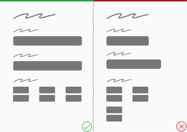
Tadaa! That's the way to get some aesthetically appealing interfaces out there :)
Let graphics dance on the same tune
When we are talking about the coordination of the elements, we cannot leave the uniformity of the graphics behind. It is more than recommended to choose a single style for all the icons and illustrations for your websites or any other interface. There is no right or wrong on what type of icons/illustrations you should use. You can opt for your favourites which speak for your ideas.
Elements hierarchy and typography
Arrangement of elements is a way to guide the user through the interfaces. Ask yourself questions like,
- What should the user see first?
- Where should the user click first when they land on your product?
- What are the key elements/features of the product?
The answers to these questions help you arrange the interface elements in a system that depicts an order or a hierarchy.
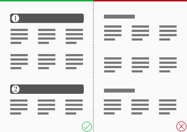
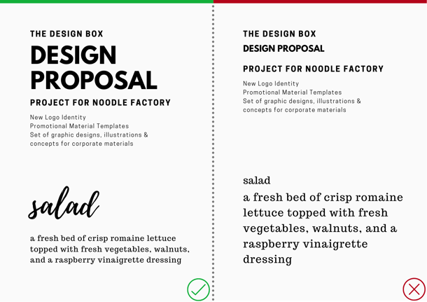
There is no debate that font styles and sizes take equal seats with graphics. Font arrangement can draw user attention to the interface sections in a well-structured order. If used right, fonts make the interfaces appealing and scannable. This art of arranging fonts is called Typography.
Speak more with fewer words
"Be concise!" That should be your motto when you are writing copy for the interfaces. The number of lines you write, the kind of words you use, and the emotions you address in your copy influence your websites/products to a great extent. Always choose concise and straight to the point copy over large and over-explained ones.
Don't be over creative
Don't try to over-optimise or over-decorate your interfaces. When a customer asks for a vanilla ice-cream, serve the best vanilla ice-cream and not add extra flavours, countless toppings to make it look amazing. Presentation is not always the answer! Don't over-tweak standard design patterns to make the interface look creative. You don't want to lose the essence of the vanilla flavour. :)
Colours are worth a thousand words
Who says only a picture can do that? Colours hold numerous emotions and should be used very carefully in the interfaces. I will dive deep into colour theory in one of my future articles where we can discover types of colours and the emotions they convey. Let's have a look at the below examples to understand a quick tip.
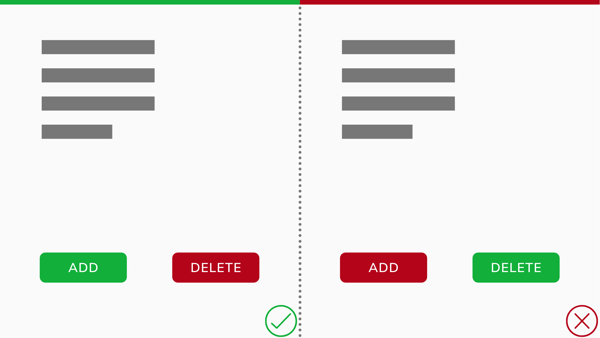
We associate red with negative and green with position actions, don't we?
Apart from the psychological influence, uniform use of colour palette also brings synergy to the interfaces.
Don't overwhelm the users
We know you got some cool features out there and you want to show them all to the users. But imagine a restaurant serving you soup, starters, main course, dessert, and drinks all together as soon as you sit on your table. Will you appreciate this experience? What will you eat first? What will happen to the other dishes when you are finishing one? The whole experience of dining will get ruined.
Users landing on your website/product are no different when it comes to consuming the features. Hence, a hierarchical revelation of features is the key to the best feature dining experience :)
A good user-experience lies in details and fundamentals. You can create some really strong interfaces by just following these core principles. Watch this space for more articles on design and experience.